
Kinder Haus Toys
A children's e-commerce site redesign
Project Brief
I took on the task to redesign the Kinder Haus Toys website. Specifically, I sought to find and remedy the issues hindering successful online purchases for this e-commerce site for children's products.
Skills & Tools
Card Sorting
Wireframing
Prototyping
Comparative Analysis
Journey Mapping
Heuristic Analysis


Role & Timeline
Lead Designer | January 2, 2024 - January 18, 2024
Research
I first tackled this project by conducting a heuristics analysis of the e-commerce site as it currently stands. The home page is a bit chaotic with an overload of colors, text, and images. Surprisingly, for an e-commerce site, there's no shopping cart icon or function, making the purchasing process unclear and frustrating.

Heuristic Analysis
To gauge if the website follows some general rules of thumb when it comes to interaction design, we used Jakob Nielsen's 10 usability heuristics for user interface design. We found the below two violations.
-
Match Between System and Real World: There is no digital shopping cart, a fundamental component in real-world purchasing.
-
Aesthetic and Minimalist Design: The design is very overwhelming, violating the principles of minimalism.
Comparative Analysis
When conducting a comparative analysis against competitors like Toys R Us, F.A.O. Schwarz and Mapamundi Kids, we observed that Kinder Haus is missing a lot of essential e-commerce functions.

I was especially impressed with FAO Schwarz due to its well-designed site with essential e-commerce elements – a search function, a shopping bag, and a clean, minimalist layout. Please see the home page screenshot of FAO Schwartz provided below.

Usability Testing
To further empathize with users, I conducted 5 usability tests that included 5 tasks. These tasks include the following:
-
Purchase a baby shower gift
-
Purchase a book for an 11 year old
-
Remove an item from your cart
-
Seek assistance
-
Find an upcoming event to bring a child to
Unfortunately, all participants experienced extreme difficulties while attempting to complete these tasks.
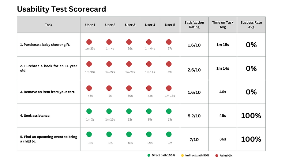
As seen in the above usability scorecard, all 5 participants failed 3 out of the 5 tasks, resulting in extremely low satisfaction with the site. For this project, I'll be prioritizing our redesign to allow users to complete these failed tasks.
I observed the testers during their experience and documented their non-verbal reactions as well as verbal reactions. While looking frustrated, test participants were making remarks like “there’s no way to actually buy anything here,” “all those pictures are really distracting,” and “unless I’m physically in Arlington, Virginia, this site is useless to me.”
Problem Statement
Our research led us to define the problem: Kinder Haus Toys needs to be redesigned so that there are direct pathways to products, clear imagery of available products, and functionality to purchase products because the site currently lacks these essential e-commerce elements.
Ideation
Based on this problem statement and research conducted, I began the ideation process to find a solution.
Card Sorting Tests
I conducted open card sorting tests with 8 participants to understand grouping. This helped me see how successful users would be when tasked with finding items in a specific information architecture tendencies.
Using these results, I also conducted a tree sort test with 5 participants.
Following the results of these tests, I mapped out how users would navigate the site in the most efficient way.

As shown above, I am offering four main options on the home page: Shop, Popular Items, Events, and an Info page. With this clear and concise information architecture, I hope users will find what they need with ease on Kinder Haus Toys.
Wireframes & Prototyping
I sketched wireframes to visualize a user-friendly interface and iterated this through Figma.
Home Page

Product Details Page

Final Mid-Fidelity Prototype
Following the sketching and wireframing, I present a mid-fidelity prototype using Figma.
Testing
Three rounds of testing validated my success in creating direct pathways, clear imagery, and functionality to purchase capabilities.
I received feedback from these tests, which led to adjustments, including workable breadcrumbs and text enlargement.
Next Steps & Takeaways
For my next steps, I intend to carry out the below actions:
-
Build out the tabs and links
-
Conduct more user testing
-
Refine imagery, content, and color schemes for a high-fidelity prototype
For this project, I reflected on the following key takeaways:
-
Take time to test out different functions on Figma as there are many different routes to design with
-
Make sure to keep testing consistent so that test results are reliable
See More Projects
 |  |  |
|---|